
Reducing friction points to event registration to support those at genetic risk of cancer
Overview
Pink Hope is an Australian not-for-profit whose mission is to raise awareness for those at increased genetic risk of cancer. Part of their mission is getting healthcare professionals to identify these vulnerable individuals earlier.
My job: To see if it was possible to encourage more clinicians to attend in-person education events (spoiler alert: “yes, but”).
Client:
Pink Hope
My role:
UX research
UX design
Workshop facilitator
Copywriting
Prototyping
Usability testing
Tools:
Figma
Figjam
Dovetail
Collaborators:
Solo project
Timeline:
5 weeks sprint
(Nov-Dec 2022)
Outcome:
Handed over to organisation’s in house designer
Assessing desirability
What I knew:
Clinician attendance at Pink Hope educational events was lower than desired.
What I did:
Mixed method research to identify characteristics of those clinicians who attended Pink Hope events.
An exploration into general motivations and barriers to attending in-person events. The key takeaway - lots of barriers to in-person attendance!


Understanding the target users
What I observed:
Primary clinician target group was unlikely to attend in-person events for oncology events.
Secondary clinician target group struggled to book into events via website (poor findability).
What I did:
Illustrated key friction points to client with protopersonas and journey maps.
Communicated non-digital UX opportunities to better reach the broader clinician population.

A quick recap of Pink Hope’s goal for clinicians:
Goal:
Earlier recognition of, and action for, those at increased genetic risk of cancer.
Specifically, at the three points of the typical private practice flow marked here with pink stars (if viewed through a service design lens):

Ultimate goal: Clinical behaviour change, rather than attendance at events specifically.
(Once I got this into my head, it was a lot easier to see the solution needed to include non-digital touchpoints)
Design solution: Optimising event findability on the website
What I observed:
Clinicians had poor time-on-task metrics compared to those of competitor sites when trying to find events on the website.
What I did:
Removed the disappearing secondary navigation bar, and made additional user interface modifications to improve scannability.
Project constraints: Nil changes to existing colour palette or font style as per client request


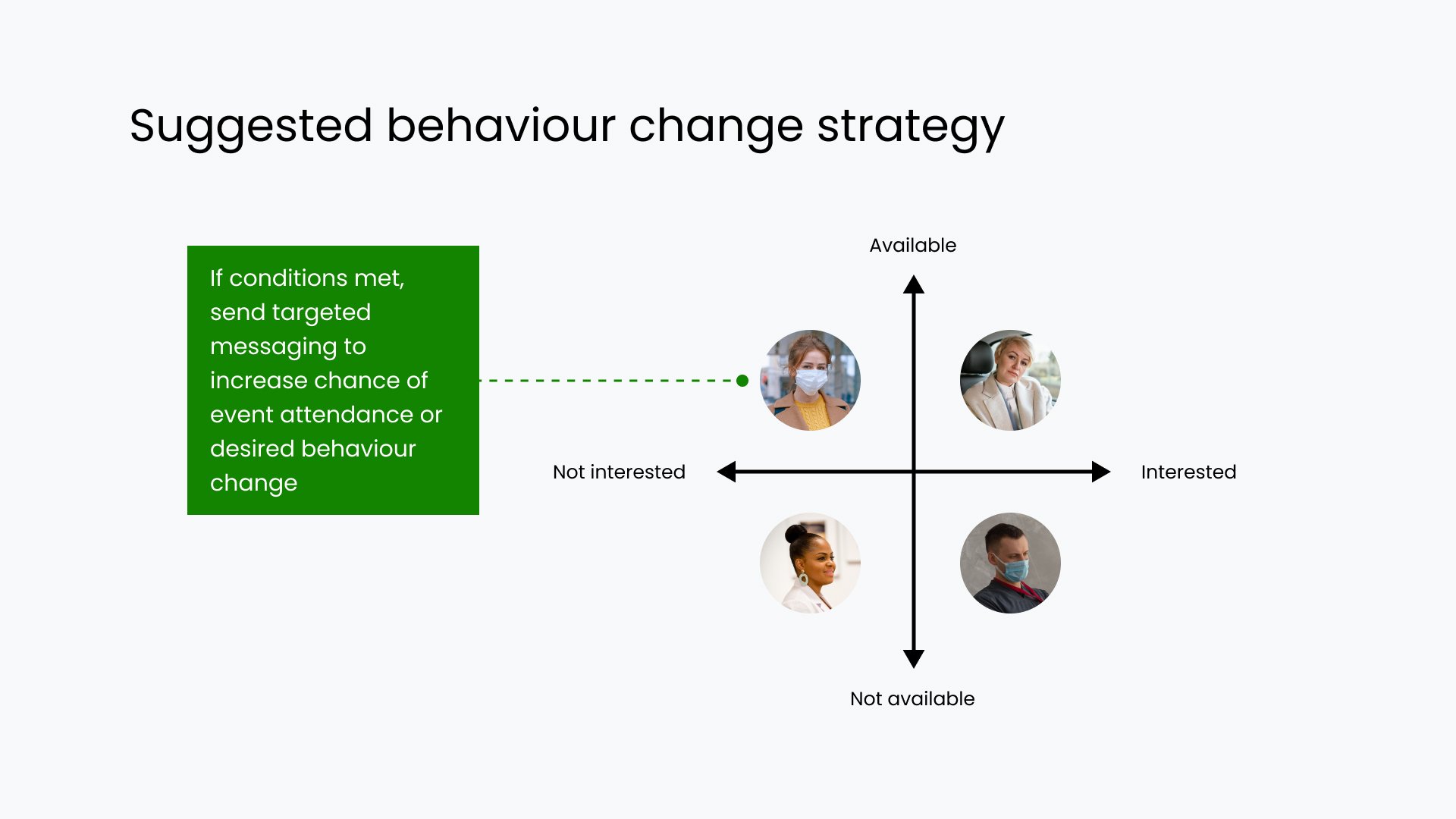
Design solution: Optimising user touchpoints
What I observed:
A significant portion of clinicians were unable or unwilling to attend in-person education events.
Most clinicians did not engage with “work-related” content on personal social media accounts
Motivation to upskill in a clinical topic was higher if clinicians were notified there was higher-than-average number of patients at risk of that condition in their location of work.
What I did:
Proposed targeted outreach to private practice clinicians working in areas with higher Jewish ancestry (based on census data).
Constraint: Not commercially feasible for organisation to host online events at this time as per conversations with client, though this is on the long-term roadmap.
Validation testing (of website flow redesign)
What I did:
Preliminary and competitive usability testing, followed by three rounds of prototype usability testing (physical product testing was beyond scope of this project’s timeline)


Metrics I’d have liked to track…
Though the project scope shifted over the course of the project, should these design solutions ship, these are the metrics I’d have liked to track:
Page views to events page
Clinician attendance at education events
What proportion of these clinicians work at a location directly outreached to by Pink Hope?
What I learned:
Clinician recruitment for interviews or testing was unexpectedly challenging - despite working in healthcare myself, many people approached were too busy or too exhausted to participate.
This little “oh, it’ll will probably be a quick UI uplift” project turned into a behaviour change project real fast 😅
Clinicians blitz through websites at the speed of light, heavily relying on clear information architecture and high-contrast CTA buttons.
Unexpected workshop insight: Clinicians preferred water bottles and coffee cups over non-usable visual prompts.
Project outcome
Project has been handed over to the organisation’s in house designer.