
Reducing task abandonment when booking in for First Aid training
Overview
First Aid training saves lives, and with over 130 years of experience, St John's NSW is well-equipped to train everyday heroes.
Over a 4-week design challenge, our goal was to support St John's mission by redesigning the user experience for course selection and booking. Could we make things easier and faster for users? We set off to find out.
My role:
UX research
UX design
Copywriting
Prototyping
Usability testing
Project co-ordination
Tools:
Figma
Figjam
Dovetail
Optimal Workshop
Useberry
Collaborators:
Meghalee
Patricia Namara
Duration:
4 weeks (approx 15hrs/week)
Outcome:
Placed 5th in hackathon (out of 27 teams)
Assessing the problem space
What we saw:
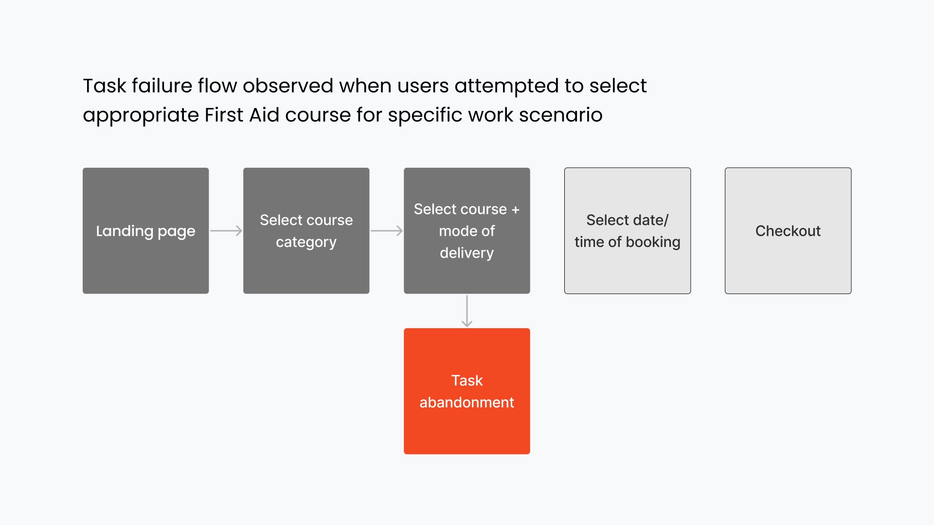
Up to 3/6 users demonstrating task failure (abandonment) during either course selection or mode of delivery selection.
What we did:
A usability audit, lots of moderated preliminary and competitor usability testing, and a phone call with St John NSW to validate our observations.


Our user and their problems
What we knew:
St John NSW receives a reasonable volume of phone calls from ‘vocational learners’ - ie people needing First Aid training for work purposes, but requiring assistance selecting the appropriate course online.
How we started:
Created a user protopersona and customer journey map to clarify which user group and user flow we’d focus on for this project.


Our solution approach
Strategic objective:
Improve user experience (and potentially conversion rates) by reducing task abandonment
Key design goals:
Increase course findability
Help users find the right course
Streamline payment process
Design solution: Increasing course findability
What we saw:
Users struggling to find specific courses, eg ‘Asthma and Anaphylaxis’ under the existing course categorisation system.
What we did:
An open card sort in an attempt to find a ‘better’ course categorisation system (spoiler alert: it didn’t exist).
What we did next:
Embraced the entire product line as the main category, and introduced keyword searches, filter tabs, and a quiz to help users scan through the range of courses with ease.


Design solution: Helping users make the right decision
What we saw:
Users getting overwhelmed when asked to select individual courses and mode of delivery options at the same time, resulting in sub-optimal task success rates.
What we did:
Separated these decisions onto two different stages, and introduced a comparison table for easily selection of mode of delivery.

Design solution: Streamlining the checkout process
What we saw: Users not seeing the original “copy my details” checkbox, resulting in user friction.
What we did: Moved the position of the checkbox (and a few other user interface uplifts).

Validation testing (metrics are bae)
What we saw:
User-driven metrics improving as we iterated.
What we did:
Ran three rounds of prototype usability testing. We decided we’d solved the problem for MVP1 when we stopped hearing “what’s the difference between these options?” from users.


Metrics we’d have liked to track…
Ultimately, our goal was to make it easier for users to find and book the right First Aid course online with confidence - but we also knew this would make things easier for St John’s NSW too.
Metrics we’d have liked to track if this redesign had shipped:
Conversion rates
If number of phone calls from people requiring First Aid for work had decreased
What we learned
Live usability testing is the GOAT. We learned a lot about how users natively explored our site, and what they looked for when stuck, and why.
Design shortcuts under time pressure: Competitive usability testing (and competitive preference testing) was a great way to get early user insights before committing to UI builds.
2.5 designers was enough (not 10-18) more =/= better, particularly if you can find two designers with complementary strengths (eg 1x UX-focused, 1x UI-focused) like we had in our team.
Unexpected insight: ‘Better’ category subdivision isn’t always the answer. As per our cardsort, we found that by eliminating the final categorisation step, it was easier for our users to find that why needed (even if it meant viewing 21 courses over 2 pages, rather than being limited to only viewing 2-10 courses at a time!)
What we would have done next:
Responsive design
Address user flow for people organising First Aid training for their school or workplace (our primary research suggests a reasonable portion of St John NSW’s conversion rates come from this group)
Explore more user engagement opportunities
More testing, particular with broader age groups more reflective of real-world target audience